20Minutes Redesign

How to increases visitors' reading time ?

Overview

For my web design class, I had to choose a famous website and Redesigning it by choosing an angle of enhancement. I choose to redesign a news website because I have a personal aversion against them. I always find that they display too much information, a lot of suggested articles are not pertinent to me. Furthermore, I often spend more time to choose which articles I will read than reading it. That why the problem that I choose was: "How to increases the visitors'reading time of 20Minutes ?"

Role

Web design project - University project

For the redesign, I have created personas, mood boards, create low and high fidelity wireframe and prototype it.


June 2019 - August 2019


UI design

Wireframe

Zoning

Figma

After Effect

We often think the more choice we have the better. But too many choices can paralized, create anxiety and leave us less satisfied

20Minutes Redesign

Problems

As I don't work for 20Minutes and don't have access to their statistics, all the problems that I raised are my point of view on the subject and may not be a problem for a majority of users

20 Minutes website may lose users due to different reasons and I selected 2 problems :

  • User can feel lost and don't know what to read in front of the number of articles
  • Irrelevant content for the user

Goals

  1. Reduce the time of the article's choice for the users
  2. Increase the users' reading time
  3. Create a reader loyalty to 20Minutes website

My redesign idea

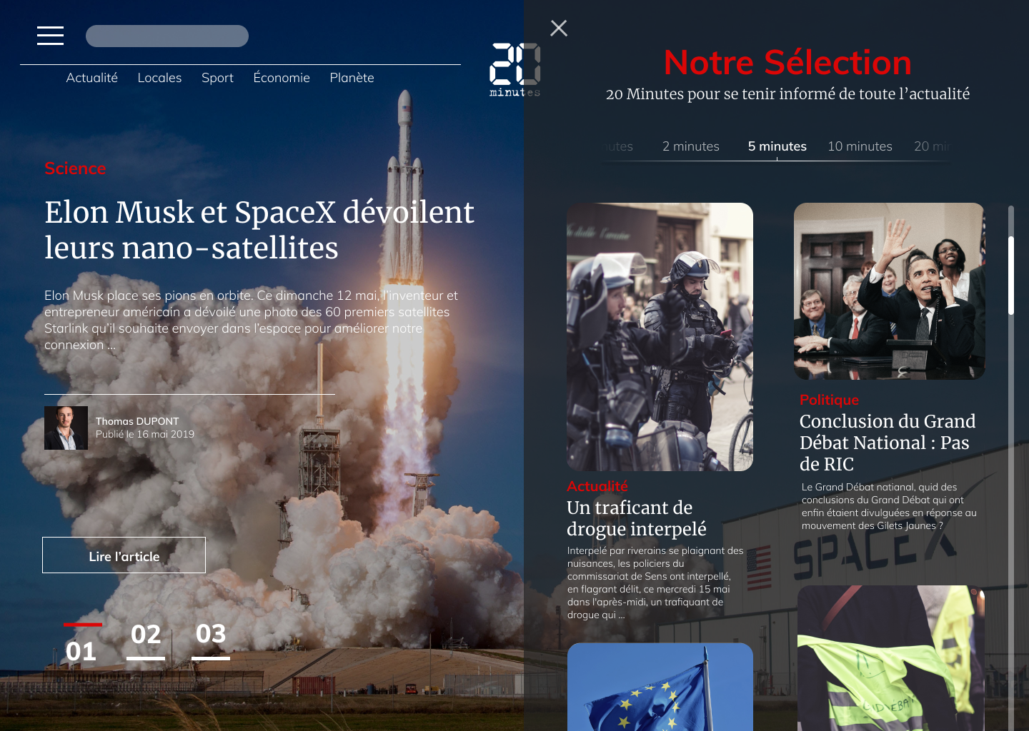
Based on the name of the website "20Minutes", I decided to make my redesign by thinking about time. What I wanted was to create an interface with which the user can choose faster an article that interests him and reading it in knowing how much time he needs to read this article. The important thing is that the suggested articles have to be based on the user's interest and in a second time on the time the user has.

With this idea in mind, I begin to work on the concept and design.
Zoning from the home page realised with Whimsical

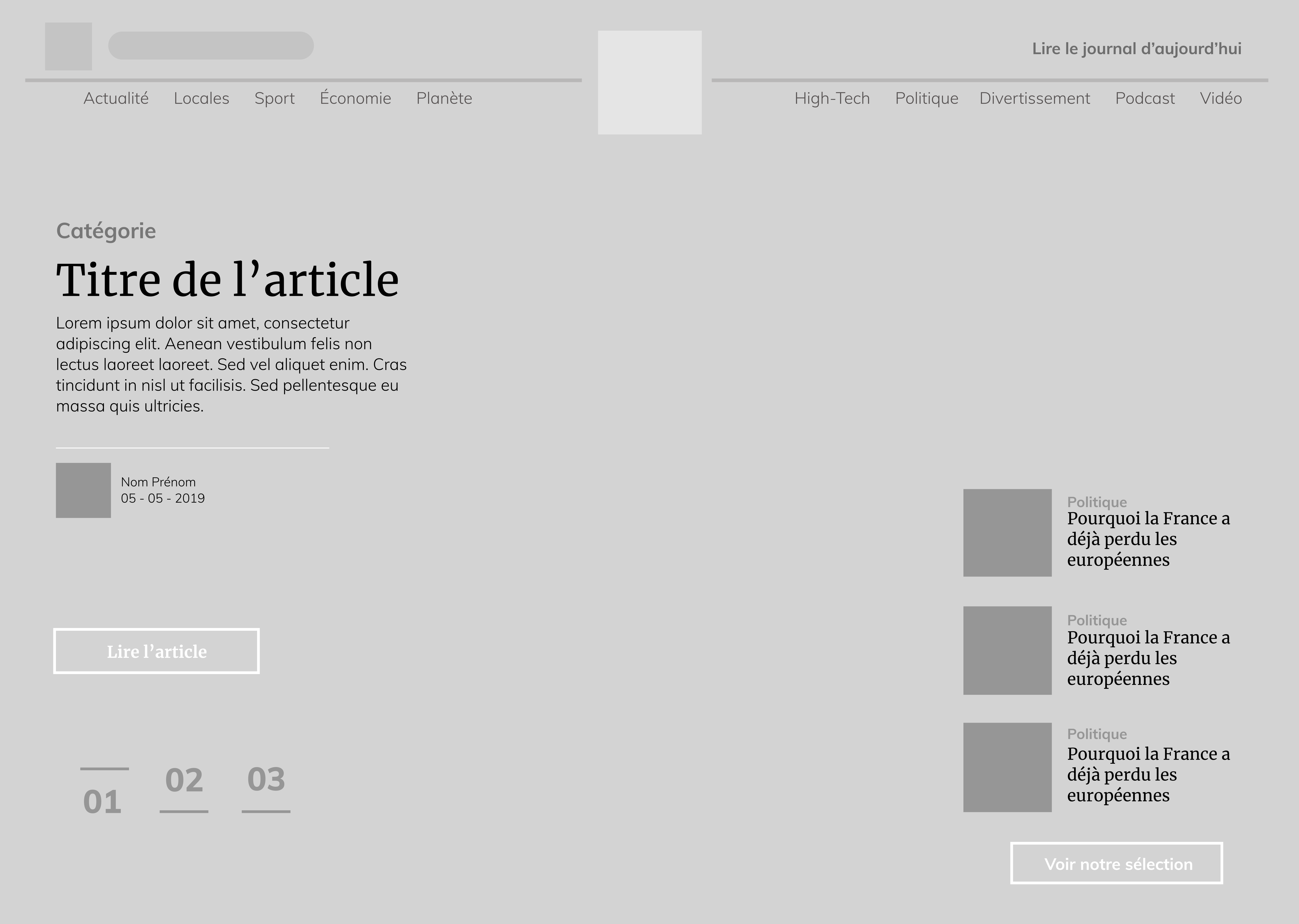
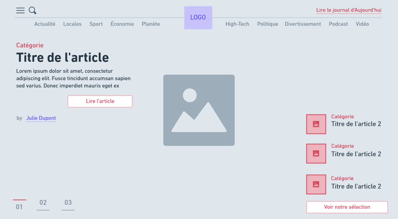
Wireframe from the home page realised with Figma

Color and Typography

For the typography, I choose to use Merriweather regular for the title because I wanted to use a serif font that reminds paper journals. For the content, I decided to use Muli as it's a simple and easy to read font.

High-fidelity Wireframe

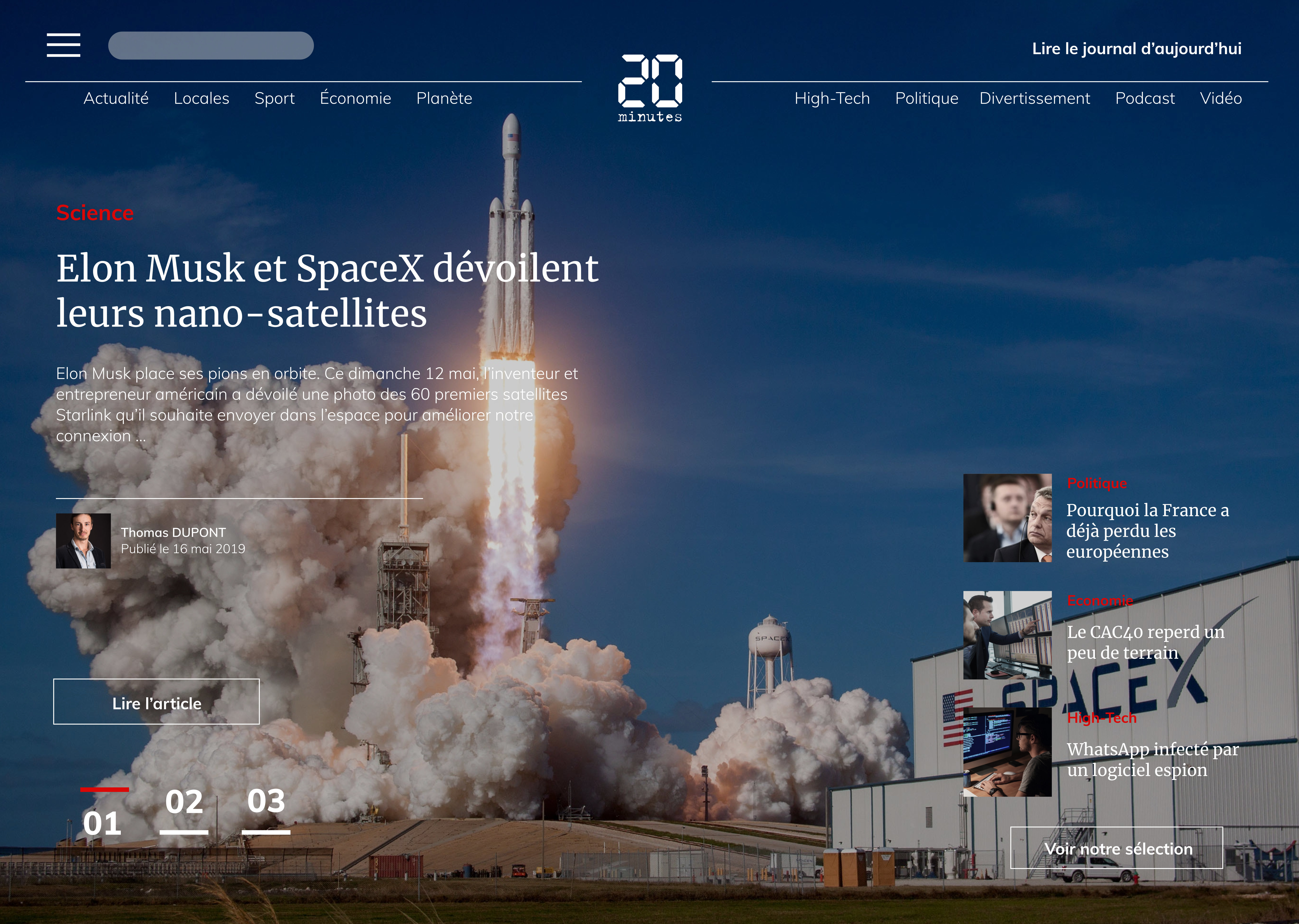
High-fidelity Wireframe (black version) from the home page realised with Figma

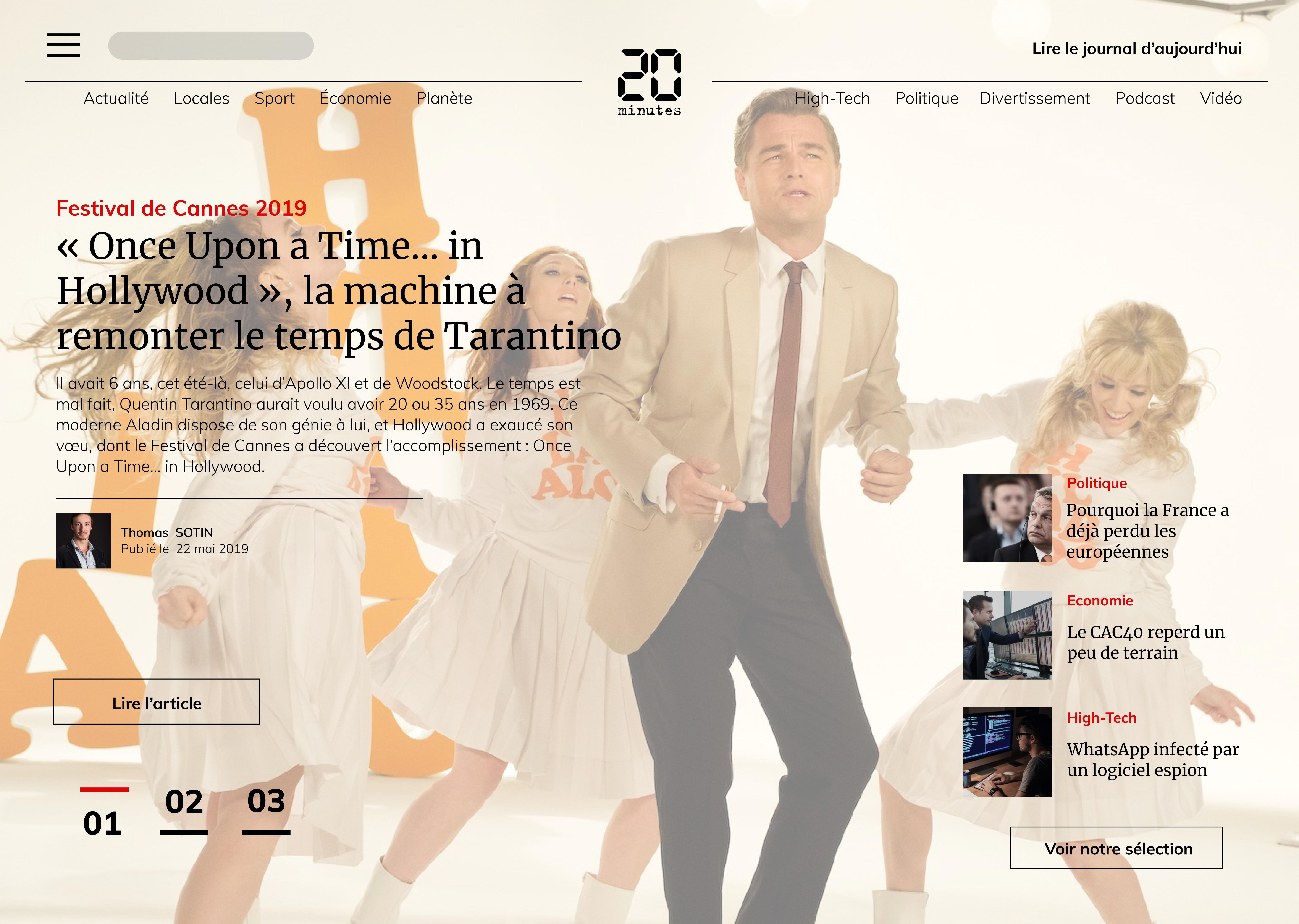
High-fidelity Wireframe (white version) from the home page realised with Figma